
Choosing a stone colour for your bench tops, splash backs, or feature walls can feel overwhelming when the range of options is this broad. Every shade, vein pattern, and tonal shift carries real consequences for your kitchen or bathroom – not just in terms of appearance, but in how your space functions and feels over the long term.
Stone colour directly influences the atmosphere of a room. It shapes how light behaves within the space, and it determines whether your design still feels current five or ten years from now, as style and design preferences change. On the practical side, the colour of your stone plays an important role in determining how visible everyday wear becomes, and how much effort goes into routine upkeep.
At Talostone®, we help homeowners, designers, and builders navigate the stone colour selection process daily. This guide covers everything worth knowing in clear, straightforward language – so you can settle on a stone colour that elevates your space, aligns with how you actually live, and delivers lasting satisfaction.
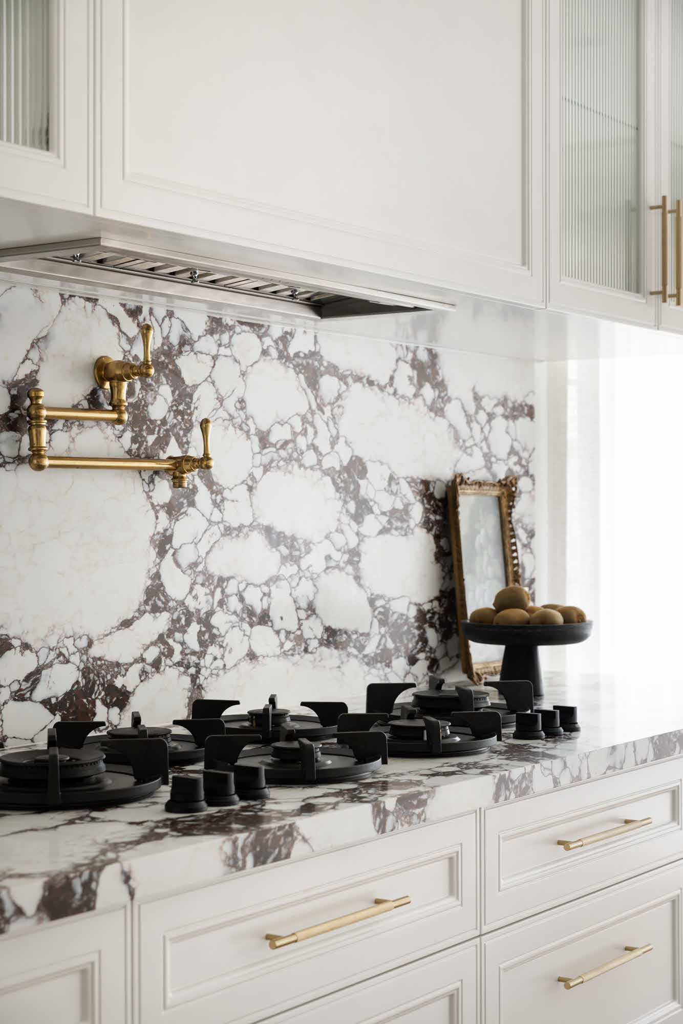
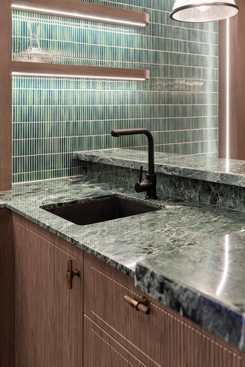
Before exploring individual colour families, it’s useful to appreciate the range on offer and what creates colour variation across different stone types.
Natural stones – marble, granite, quartzite – owe their colour to the specific minerals present during formation deep underground. The result is that no two slabs are truly identical. Even slabs extracted from the same quarry block will differ in veining, movement, and colour depth. For some homeowners, this organic irregularity is part of the appeal. Others prefer something more uniform and predictable.
Talostone®‘s mineral surface collection (MinQ Zero) offers a contrasting approach. These stones are very natural looking, because they are replicated to look like natural marble. Each slab is created individually, which results in every slab having its own unique nuances… just like natural stone.
Our sintered stone range provides yet another option – surfaces created from natural raw materials fused under extreme heat and pressure. The stone is very uniform and consistent, with lightweight 12mm stone being better for cladding large walls.
Selecting stone colours accurately demands seeing full slabs rather than depending on small samples in isolation. A 10cm chip might communicate the base tone, but it won’t reveal how veining travels across a 3-metre island benchtop or how pattern distribution varies across multiple slabs. This is why visiting our warehouse can help you, because you’ll be able to see the stone as a large slab – not just a small sample.
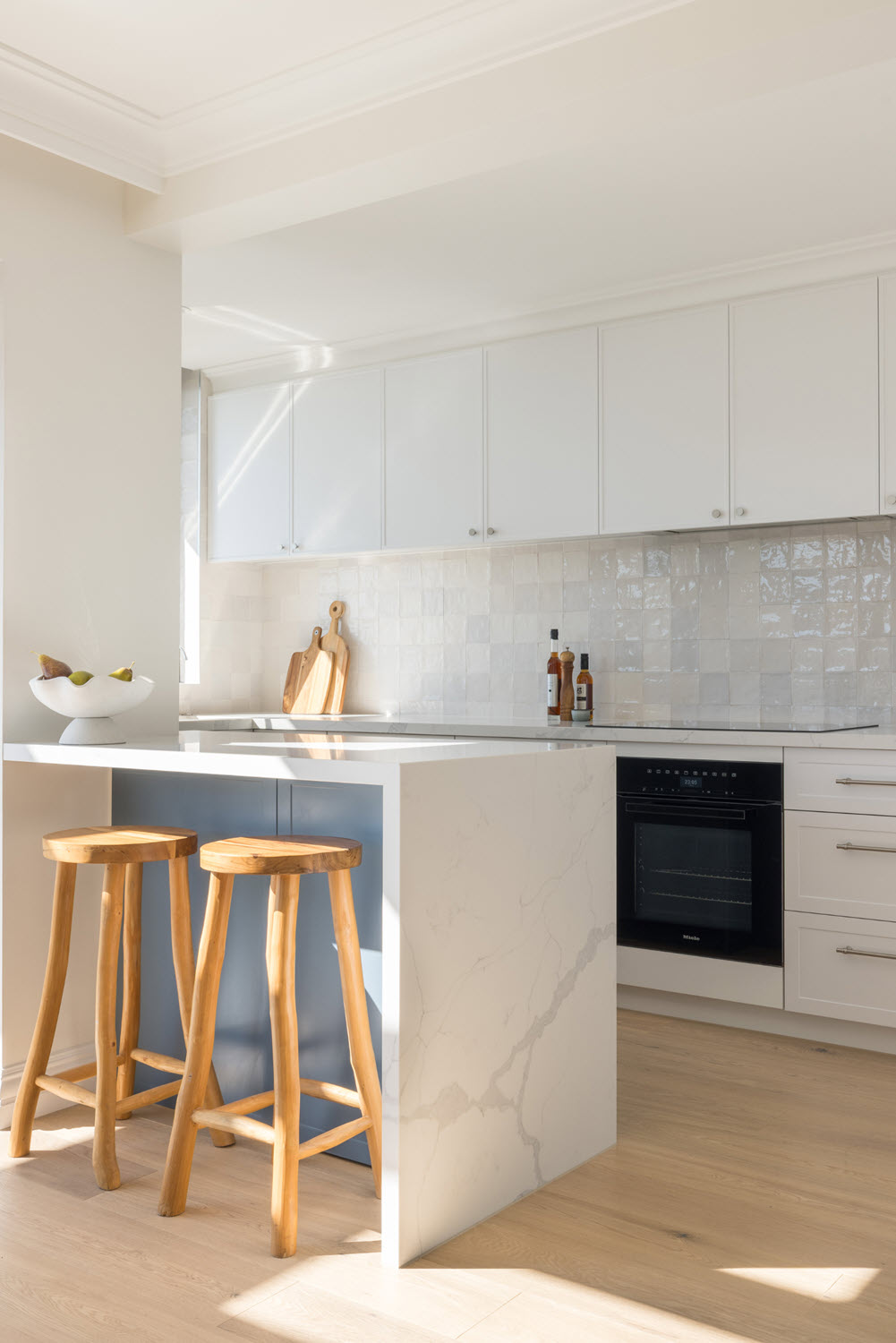
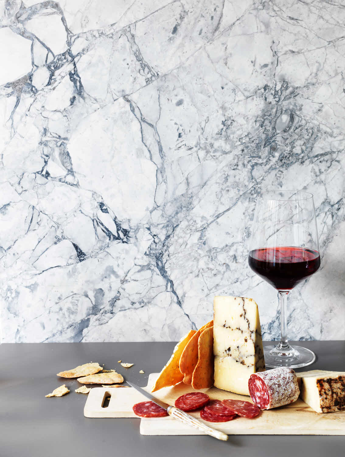
White and light-toned stones consistently rank as the most popular selections in Sydney and Melbourne homes – and the reasons are entirely practical. These stone colours open up a space visually, reflect light effectively, and offer a neutral base that pairs with almost any cabinetry colour or design approach.
Kitchens with limited natural light gain significantly from white stone benchtops. The reflective quality of the surface redirects available light around the room, making the space read as brighter and more generous than its actual footprint. In compact kitchens or galley configurations, white stone prevents the benchtop from visually compressing the room.
White and light stone colours also bridge warm and cool palettes with ease. Whether your cabinetry features warm timber tones or cooler greys, a white benchtop introduces breathing room that lets other design elements carry their weight.
White stones differ considerably from one another. Some carry bold grey or gold veining that draws the eye, while others read as near-pure white with barely any visible pattern. It’s worth thinking about how much visual attention you want your benchtop to attract. In kitchens where cabinetry, splashbacks, or other elements already carry strong visual energy, a quieter white stone with restrained veining helps maintain balance. In a pared-back, minimalist kitchen, a white stone with expressive veining can become the room’s defining feature.
A persistent misconception holds that white stone is inherently difficult to maintain or prone to staining compared to other stone colours. In practice, maintenance depends far more on the type of stone than the colour itself. White marble is more porous than white quartzite and requires more attentive care. White sintered stone is non-porous and surprisingly resilient against spills and daily use.
Rather than ruling out white stone on maintenance grounds alone, it makes more sense to discuss the specific properties of any stone you’re considering – its porosity, durability, and care requirements – with your supplier or stonemason.
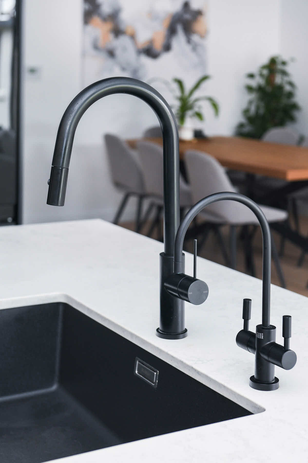
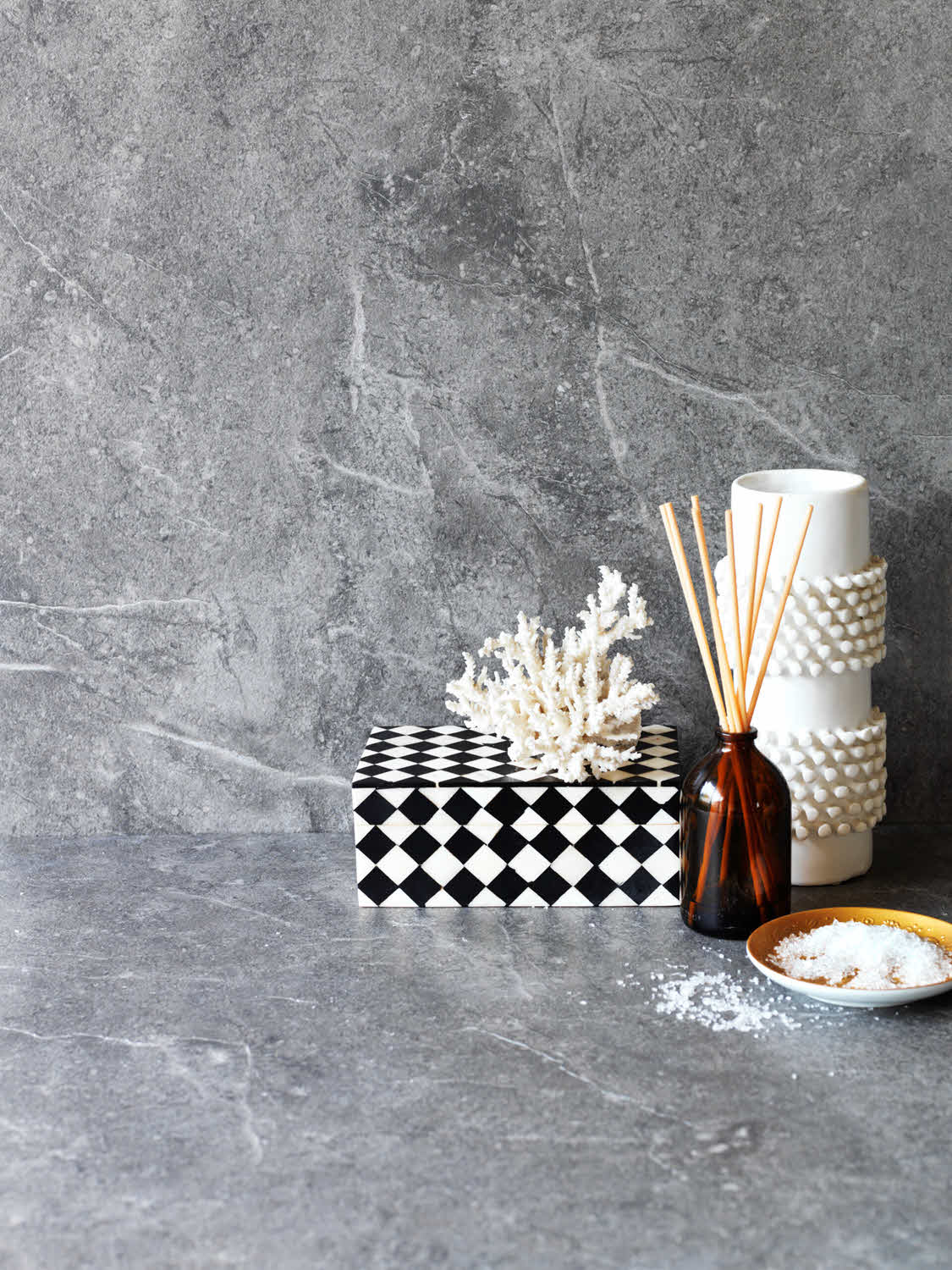
Grey has cemented its place as the go-to neutral for modern interior design across Sydney and Melbourne. Naturally, grey stone benchtops have followed the same trajectory. A key advantage of grey stone colours is that they deliver visual depth without the sharpness of pure white – and they’re considerably more forgiving when it comes to concealing dust and minor surface wear.
Grey stone spans a vast spectrum: pale silver-greys that sit just a step away from white, through to dense charcoal tones that could be mistaken for black depending on the lighting. Across this range, grey stone colours can lean cool or warm, depending on the undertones present in each specific shade.
In open-plan living areas where the kitchen transitions into dining and lounge zones, grey stone benchtops provide visual continuity without competing for attention. Grey is substantial enough to anchor the kitchen while staying neutral enough to defer to statement furniture, artwork, or architectural details in adjoining spaces.
Grey stone also pairs exceptionally well with two-tone cabinetry schemes. Setting grey benchtops alongside white upper cabinets and darker lower cabinets introduces layered depth – without introducing conflicting visual ideas.
As with white options, grey stones range from near-solid tones to heavily veined varieties featuring white or charcoal streaks. Kitchen proportions matter here. In compact kitchens, intensely patterned grey stone can feel visually congested. In larger kitchens, that same level of veining generates interest and prevents the space from reading as flat or monotonous.
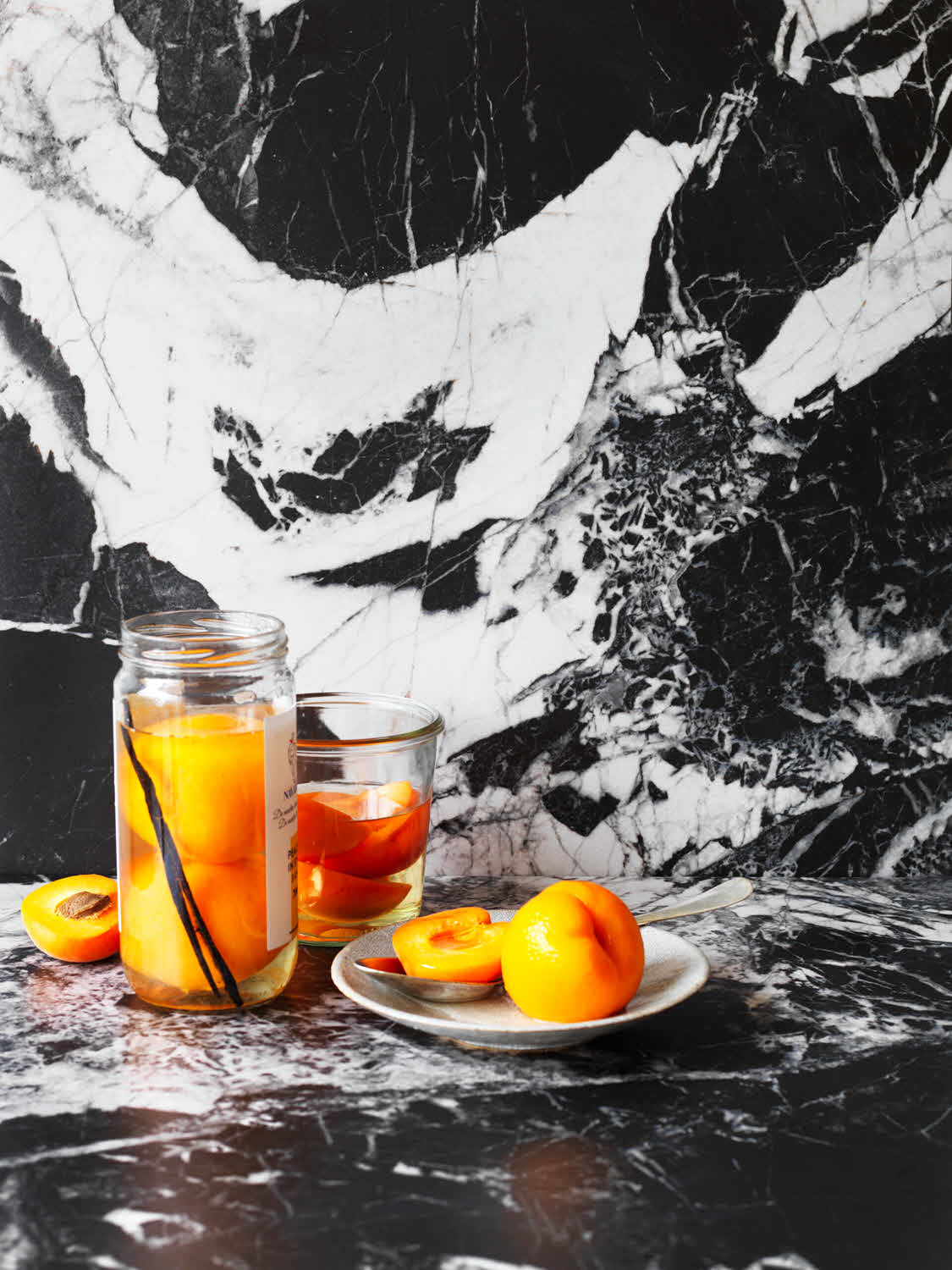
Black and deeply dark stone colours carry unmistakable presence. These options introduce visual weight, a sense of richness, and can produce arresting contrast when placed thoughtfully.
Kitchens with generous natural light can accommodate dark benchtops without the risk of the room feeling enclosed. The critical factor is ensuring sufficient ambient light – whether from windows, skylights, or well-planned artificial lighting. In bright, open environments, black stone provides visual grounding that stops the space from feeling bleached or sterile.
Dark stone also excels at creating contrast. Pairing black or very dark stone benchtops with white or pale cabinetry produces the crisp, high-contrast look frequently seen in contemporary kitchen design. The result is visual clarity – different zones and elements within the room become immediately legible.
Dark stone colours reveal dust, water marks, and fingerprints more readily than lighter alternatives. This doesn’t make dark stone impractical – but it does mean wiping down your surfaces more frequently to keep them looking fresh. In households with young children or where kitchen upkeep isn’t a major priority, lighter stone colours tend to be more forgiving of daily life.
Many dark stones feature white, gold, or grey veining that creates powerful visual drama. Veined patterns in dark stone can range from quiet, understated threads to sweeping, large-scale movements that dominate the surface. When designing with heavily veined dark stone, the benchtop becomes the focal point of the space – surrounding finishes and fixtures should remain restrained to give the stone room to do its work.
Warm-toned stones in the beige, cream, and taupe families create welcoming, comfortable rooms that feel settled and inviting immediately. These stone colours pair particularly well with transitional or traditionally styled homes.
Warm stone colours complement timber with a natural ease that makes them strong candidates for kitchens featuring timber cabinetry or exposed wooden structural elements. The tonal harmony produces a cohesive, grounded aesthetic that connects interior surfaces to organic materials.
Warm-toned stones also weather daily use gracefully. Minor marks, developing patina, and the gradual changes that accumulate over years of use tend to integrate into the existing colour rather than registering as obvious blemishes. In homes where character carries more value than flawlessness, warm stone colours develop a richer quality over time.
If you’re renovating a kitchen but retaining existing flooring, warm stone benchtops can help unify otherwise disconnected materials. Beige and taupe stones contain enough tonal complexity to bridge different wood tones or pick up subtle undertones in existing tiles.
Warm stones respond particularly well to warm artificial lighting. Under LED downlights with warmer colour temperatures (2700K–3000K), these stones appear richer and more dimensional. Under cooler lighting, the same stone can appear muted or take on a slightly grey cast. When considering warm-toned stone colours, test how they appear under the specific lighting conditions planned for your finished kitchen.
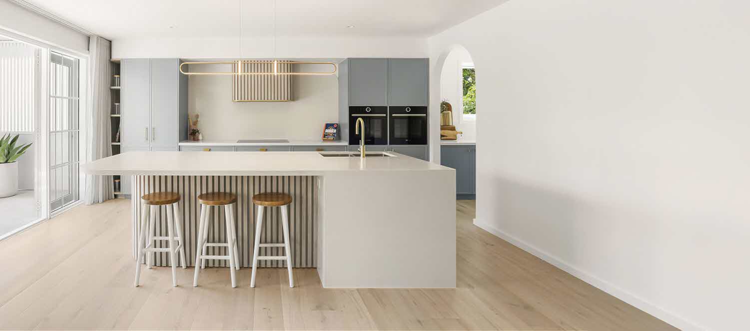
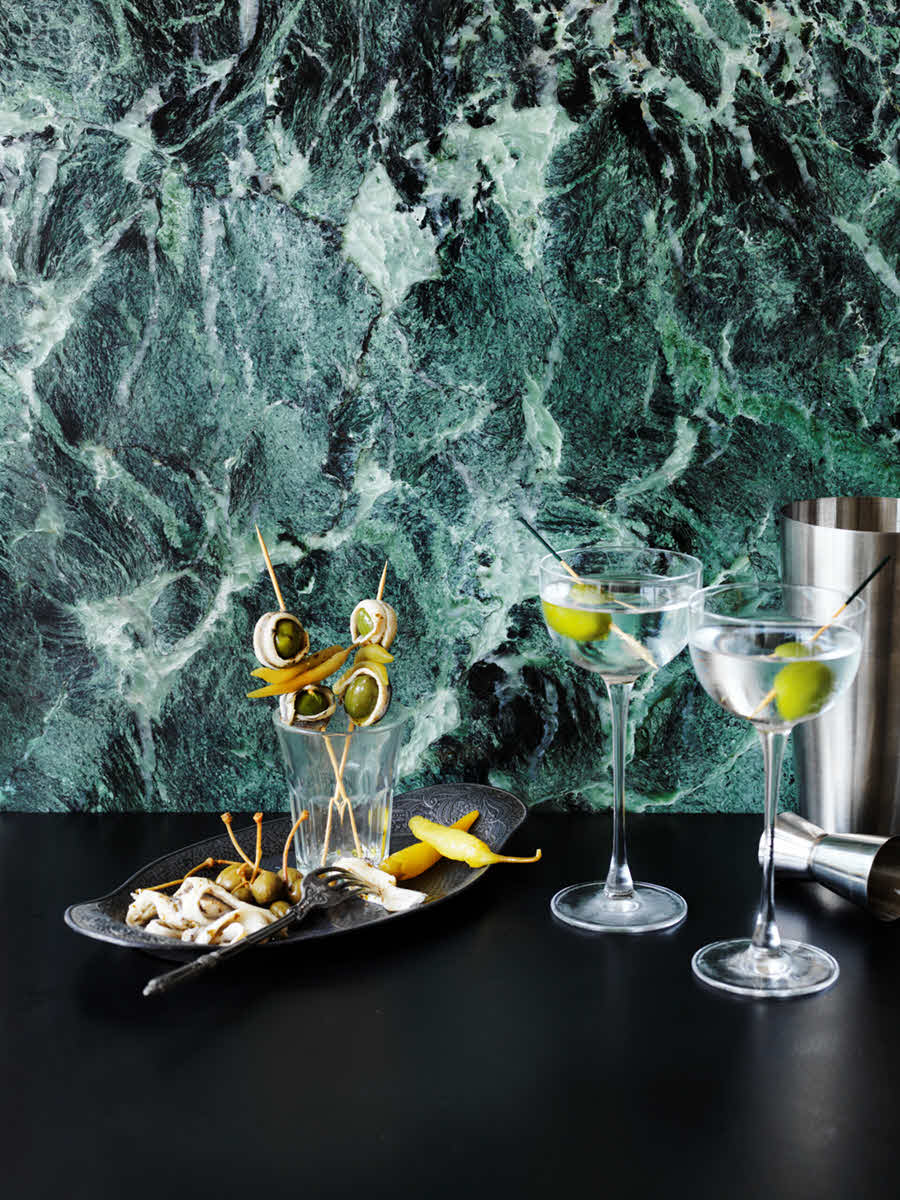
While neutrals dominate Australian kitchens, there’s a growing interest in distinctly coloured stone – deep greens, saturated blues, warm terracottas, and even pink-toned options. These stones aren’t suited to every setting, but in the appropriate context, they create spaces with authentic individuality.
If your home already embraces a maximalist, eclectic, or confidently contemporary design language, a coloured stone benchtop can feel like a logical extension of your existing approach rather than an isolated statement. Bold stone colours deliver their best results when the surrounding design is intentional and unified – placing a coloured stone in an otherwise cautious, neutral kitchen rarely achieves the desired effect.
Smaller-scale applications are also ideal territory for bold stone colours. A powder room vanity in deep green stone creates a lasting impression without requiring you to commit to that colour in your primary kitchen. A fireplace surround in blue-veined stone becomes a conversation piece without influencing your daily routine the way a kitchen benchtop would.
Bold stone colours are inherently more personal and less broadly appealing than neutrals. If you’re renovating with resale as a consideration within the next five to ten years, neutral stone colours provide wider market acceptance. If this is your long-term home and the colour genuinely resonates with you, personal satisfaction is the only metric worth weighing.
Working with a coloured stone demands discipline elsewhere in the scheme. The benchtop becomes the primary visual event, which means cabinetry, splashbacks, and other finishes should play a supporting role rather than competing for attention. Clean-lined cabinetry in neutral tones allows bold stone colours to carry the room without creating visual overload.
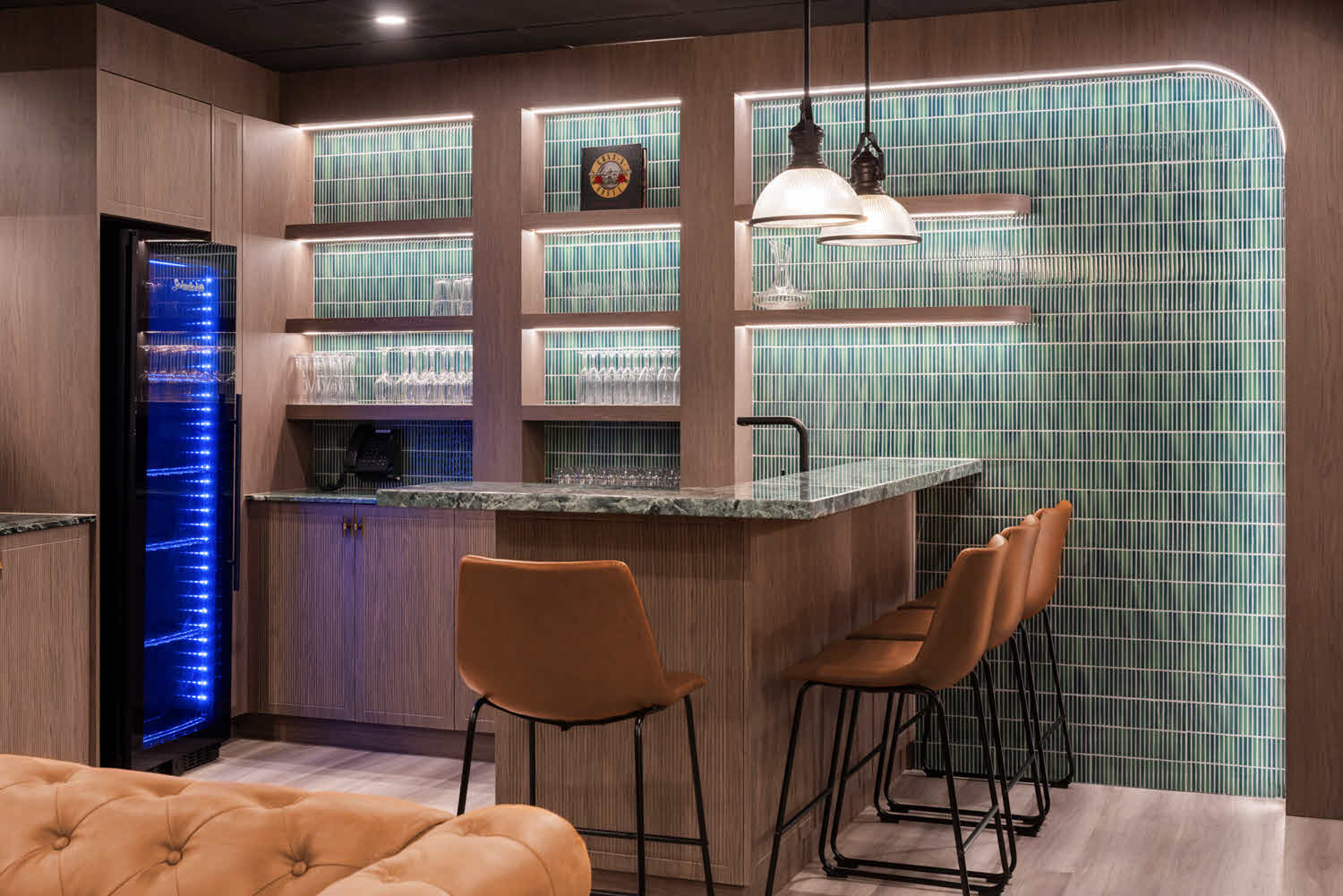
Beyond base colour, the quantity and character of veining dramatically affects how stone reads within your space. Some stones present as near-solid colours with minimal patterning, while others carry sweeping veins that create significant visual energy.
Stones with minimal veining or very fine, delicate patterns produce calm, composed surfaces. These options suit minimalist or Scandinavian-influenced kitchens where simplicity and restraint define the design intent. Understated veining also leaves room for other design elements – distinctive cabinet hardware, textured splashbacks, or sculptural lighting – to carry the visual focus.
Many of the most widely selected stones feature moderate veining that introduces visual interest without overwhelming the space. This middle range delivers the organic, natural quality that draws people to stone while remaining adaptable enough to work across various design directions.
Heavily veined stones with sweeping, large-scale patterns make unambiguous statements. These stones perform beautifully as feature applications – a waterfall island in expressively veined natural stone, mineral surfaces, or sintered stone elevates the entire kitchen. The key is treating these stones as the room’s centrepiece and keeping adjacent finishes relatively subdued.
Book matching and slab layout
For stones with distinctive veining, how slabs are positioned and joined affects the finished result considerably. Book matching – where consecutive slabs are opened like facing pages to produce mirror-image patterns – creates symmetrical, intentional compositions. Random matching yields more organic, less predictable results. Discussing these layout approaches with your stonemason during selection ensures the final installation reflects your intent.
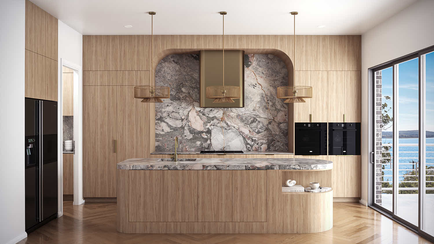
Stone colour selection works best when it accounts for the broader setting of your home and how the kitchen relates to surrounding spaces.
In open-plan homes, your kitchen stone colour needs to sit comfortably alongside flooring, furniture, and finishes in connected living and dining areas. A stone colour that echoes or complements tones already present in these spaces builds visual coherence. Alternatively, using the benchtop to deliberately introduce a new tone can work effectively, though it requires more design intentionality.
If your renovation keeps existing timber floors, tile splashbacks, or stone surfaces elsewhere in the home, your new benchtop colour needs to coordinate with those materials. Bring samples of existing finishes to your stone selection appointment – or better still, take stone samples home to evaluate them in their actual environment.
North-facing rooms receive warm, steady light throughout the day, which enhances warm stone tones and draws out golden undertones. South-facing rooms receive cooler, more diffused light that can make warm stones appear flatter or greyer than anticipated. East and west-facing kitchens experience marked light shifts from morning to evening, which means your stone will present differently at breakfast compared to dinner.
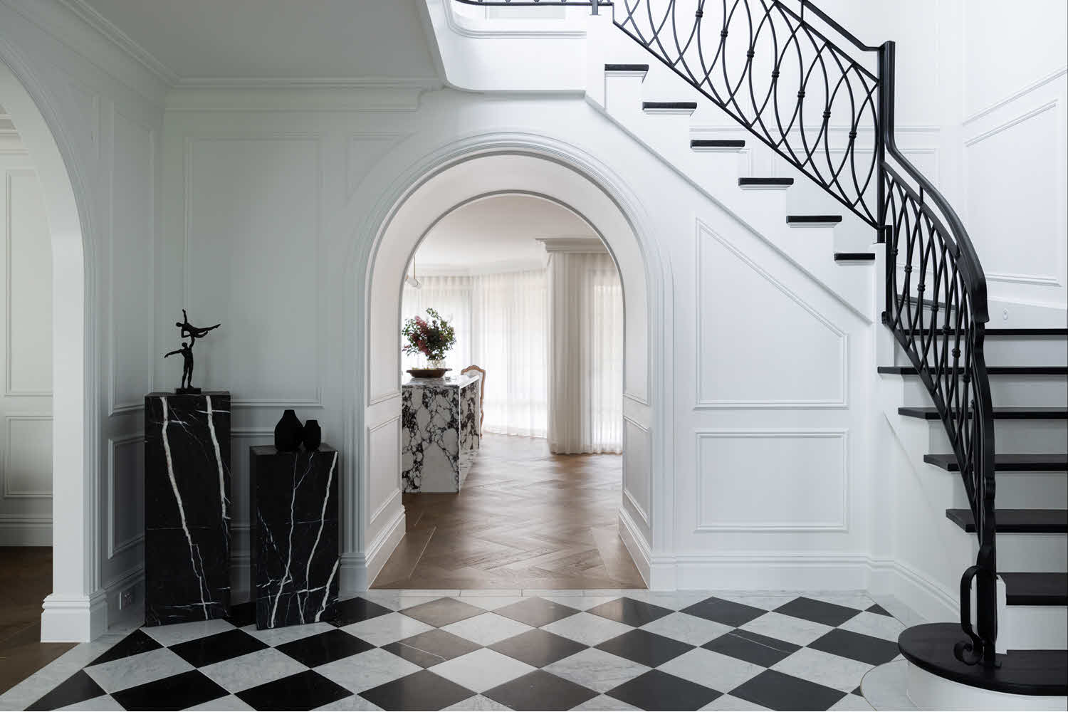
Beyond visual appeal, practical factors should shape your stone colour choice – especially in high-traffic family kitchens.
Very light and very dark stone colours reveal marks, water spots, and minor surface scratches more readily than mid-tone options. This doesn’t disqualify them – it simply means your expectations around upkeep need to correspond with reality. If you value surfaces that consistently look clean without constant attention, mid-tone greys or warm beiges tend to be more accommodating.
Stones with active patterns, moderate veining, or natural colour variation tend to conceal minor chips, small stains, or light etching more effectively than solid-coloured surfaces. This isn’t a reason to skip routine care, but it does mean daily use leaves less obvious evidence.
Certain stones – particularly marble and other calcareous materials – react poorly to acidic cleaners or acidic foods. For example white quartzites are reactive to acidic products. If you’re drawn to white marble but your cooking regularly involves citrus, tomatoes, or vinegar, understanding this sensitivity is important; in this case, mineral surfaces or Sintered stone would be a better option.
Narrowing your stone colour choice from a vast selection down to the right slab benefits from a structured approach.
Identify what’s already decided in your design – cabinetry colour, flooring, wall colour, overall stylistic direction. This immediately eliminates stone colours that won’t work alongside these elements and narrows your selection meaningfully.
Decide whether you’re drawn to whites, greys, blacks, warm neutrals, or bold tones. This single decision reduces your options by half or more.
Determine whether you want minimal, moderate, or expressive veining. This further refines the field and helps our team direct you toward suitable options within our mineral surface, natural stone, and sintered stone collections.
Visit our warehouse to view full slabs rather than relying exclusively on small samples or online imagery. Full slabs reveal how pattern flows and distributes across real-world dimensions, which substantially affects the finished appearance in your kitchen.
Once you’ve narrowed your selection to two or three contenders, take samples home or order them through our online samples service. Evaluate them in your own kitchen space, under your actual lighting, and alongside your cabinetry. Stone invariably looks different under showroom lighting compared to residential conditions – this step can prevent costly second-guessing after installation.
People frequently overthink stone selection after responding strongly to a particular slab on first viewing. Because this process is deeply personal, your instinctive reaction often carries real weight. If you walk into a showroom and feel an immediate connection with a specific stone, there’s a reasonable chance that instinct is pointing you in the right direction.
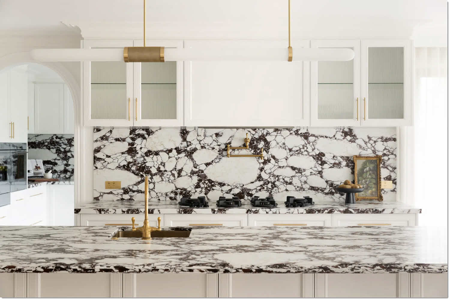
No rule requires you to use identical stone throughout your home. Varying your stone selections by room introduces visual interest and gives each space its own distinct identity.
Your kitchen benchtop might be a practical mid-tone grey chosen for its ability to absorb daily wear, while your ensuite features a refined white marble vanity that experiences gentler use. These spaces serve different purposes and can reasonably accommodate different care requirements.
Using a bolder or more premium stone for smaller applications – a bathroom vanity, fireplace surround, or accent wall – lets you incorporate colours or patterns you love without the expense or commitment of covering expansive benchtop areas.
Stones in different rooms don’t need to be identical, but they should share some unifying thread – similar undertones, complementary veining character, or a coherent colour narrative running through the home. This produces intentional variation rather than a disconnected patchwork.
Selecting the ideal stone colour for your home ultimately rests on understanding your space, clarifying your priorities, and giving appropriate weight to your own instincts.
Consider the architectural character of your home, the volume and quality of natural light, how the kitchen connects to adjacent areas, and your personal response to different stone colours. Factor in your lifestyle and maintenance expectations – whether you need a surface that absorbs everyday wear without showing it, or whether you’re prepared to care for a more delicate stone that delivers precisely the look you want.
Thoughtful decisions – such as choosing a versatile, practical colour for primary benchtops while incorporating a more distinctive stone for smaller feature applications – let you balance functional needs with design ambition.
For inspiration and to explore the full spectrum of stone colours across Talostone®‘s mineral surface, natural stone, and sintered stone collections, browse our product ranges online. When you’re ready to see how different stone colours look and feel at full scale, consider booking a visit to our City Experience Centre, where you can view complete slabs and observe how different stones respond to natural light throughout the day.
Ready to explore your options?
Get in touch with our team – call us on 02 8783 0600 or drop us an email at info@talostone.com.au